A Data Science Portal
The full potential of data: client connections and project progress in one place.
A Case Study
Client: CREWASIS
Team:
Jozie Konczal - UX Researcher, Writer & Design Support
Lydia Connors - UX Researcher & Designer
Corinne Wong - Lead Designer & Researcher
Lineliz Vassallo - Support
About My Role:
CREWASIS is a data science consultancy that helps businesses meet their goals while integrating recent graduates into the data science field.
Project Overview:
While the CREWASIS Data Scientists are well versed in methods of obtaining valuable information for customers, they struggle to effectively communicate with those customers. As an answer for this, my team crafted a dynamic backend portal for their use. This tool allows them access to customer feedback on the information that has already been delivered, and furthermore streamlines the process of updating an ongoing project. Throughout their four week length project springs with clients, the Data Science Portal provides CREWASIS data scientists with the necessary resources and information in order to ensure peak performance and customer satisfaction.
Within my role as UX Researcher, Writer, and Supporting Designer, I worked to determine the key needs of the data scientists through interviews and comparative research. My team and I determined the most essential pieces of the portal through wireframing and usability testing.
Discover
Discover
Data scientists extract actionable insights from data to drive informed decisions and solve complex problems.
This project required an integration into the complex world of data and its uses, so that we could gain a better understanding of a data scientist’s needs and frustrations. We achieved this through user interviews and investigations into comparative tools.
Comparative Analysis revealed an opportunity to integrate a variety of tools into a singular platform.
As we had no access to developed professional portals developed for other data science firms, we evaluated platforms that feature or combine services that could benefit our MVP. These evaluated services included file management platforms (Google docs, Tableau), workplace communication platforms (Slack, Figma), client management and coordinations services (Salesforce), as well as platforms that combined one or more of these uses (Clinked).
This survey of services gave us a general idea of uses the backend portal might provide for the data scientists.
User interviews revealed that users needed the portal to streamline the process of refining and communicating their findings.

My team created the following “I” statements to represent our user interview findings. We referred to these statements throughout the project in order to maintain focus on the needs of our users.
Define
Define
Our persona, Parva, represents our users and stands as the person for whom we designed.
Frustrations:
Customers don’t always provide enough information on the types of data they’d like to receive.
No streamlined access to resources
Internal feedback is often difficult to find
Goals:
Turn discovered data into meaningful models to customers.
Successfully incorporate internal and external feedback into actionable weekly insights
Provide clients with meaningful solutions to their individualized problem statements

Parva needs a unified platform for better collaboration, communication, and feedback to improve weekly deliverables.
This problem statement reflects our research findings and will guide the scope and goals of our project. While bearing this problem statement in mind, we consider:
How might we facilitate real-time feedback and collaboration to enhance alignment and efficiency?
How might we create a way to track progress and centralize resources throughout the project sprint?
How might we offer Parva guidance in choosing the best data models and visualizations to meet client needs?

Based on our feature prioritization matrix. We decided to focus on including the following in our MVP:
Client Communication
Team Communication
A Resource Library
Progress Tracking
User Profile
Design
Design
Our key developing features would prioritize internal and external communication, streamlining resources, and tracking progress.
Dashboard/Homepage:
Wireframes

My team collaboratively created this wireframe of the portal landing page. We wanted users to have easy access to projects in progress, and to be able to view past projects. We also prioritized Bookmarked Insights. The CREWASIS team generates 5 insights per week for their clients, and iterates/expands on these insights according to client feedback. With the bookmarked insights on the homepage, if the user had an insight in progress to which they needed to return, it would be easily accessible to them.
In the wireframe iteration, we also included access to the client database, thinking that a user might need to access or contact particular clients.
Project Page:
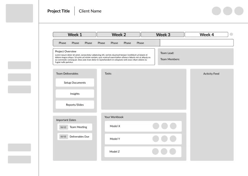
We imagined a project page for each of CREWASIS’s project sprints. This page would include all essential information regarding that project, including team members, deliverable, upcoming tasks, recent updates to insights and deliverables within the activity feed (which would also feature any changes or new information submitted on the client’s end). We also wanted users to see important project dates, and have access to data models relating to the project.
Insights Page:
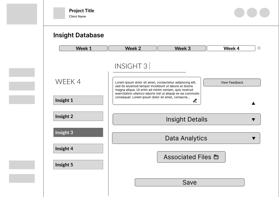
We planned for the Insights Page to be organized by the weeks of the project sprint, as well as by the individual insights. We planned for this page allow users to view feedback from both team members and clients on the selected insight, as well as associated models and documents. Knowing the importance of communication, we wanted feedback to be one of the most apparent components of the page.
This page was one I spearheaded during in the wireframing stage. In retrospect, I recognize the inconsistencies in text and CTA on this draft, and those elements were among those first addressed in the reiterating of this page leading into mid-fidelity development for the purposes of usability testing.
Resource Library:

We were eager to get feedback from users on the Resource Library page as we prepared for usability testing. We knew when we built the wireframes that we wanted to provide users with a page that helped streamline the process of sourcing and modeling data. Many of CREWASIS’s data scientists are recent graduates, and therefore early in their careers. This being the case, we also wanted to provide them with resources that might offer some guidance on the more difficult aspects of the field, such as leading client presentations.
We built the bones of the Resource Library page knowing it would likely see a lot of changes once we received feedback from users on what would be the most beneficial to them on this page.
Progress Tracking:

For the purposes of our wireframe, a member of our team built out a rough version of the progress tracking page that would allow users to check the progress of individual projects. We knew that in order to better develop this page, we needed more intel from our users on their current tracking methods, and to further consider the most effective way for users to access this page.
Testing
Testing
Usability testing drew our attention to the need for a simplified home page, a lack of clarity in regards to how to access insights, and further emphasized the need to spotlight feedback.
Task 1: For the first task, we asked testees to reach the screen that would allow them to edit an insight.
The video below shows our happy path; or the path that hoped users would take to accomplish this task within the mid-fidelity prototype.
Results:
Usability Testing of Mid-Fidelity Prototypes
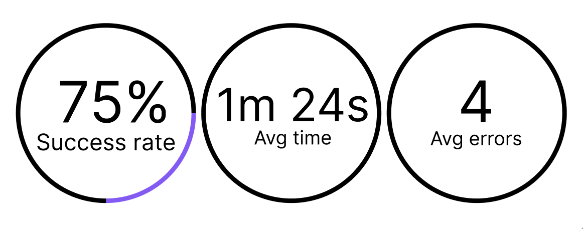
We tested our prototype on 8 users, and while users responded positively, the testing did reveal some kinks that still needed to be ironed out, and a few changes that needed to be made in order to reach peak usability.
Our goal was for the first task to be achievable for users in under two minutes. While this was successful, we noticed points at which users hesitated or struggled to find the CTA they needed.
Errors:
Users attempted to access insights via the favorited insights on the homepage, which had not yet been connected to forthcoming pages.
Points of hesitation:
Locating access to insights: the location of the CTA that led users from the project page to the insights page was not immediately clear to users. This lack of clarity resulted in some hesitation on the projects page as they determined how best to access and edit insights.

Task 2: For the second, we asked testees to check the progress of a project.
The video below shows the happy path for this task.
Results:

Users accomplished our second task in under a minute as we’d hoped. The 75% of tested users who successfully completed the ask did so with fewer errors than in the first task.
Errors:
When users reached a project page, they struggled to identify the CTA that would allow them to view the progress tracking overlay.
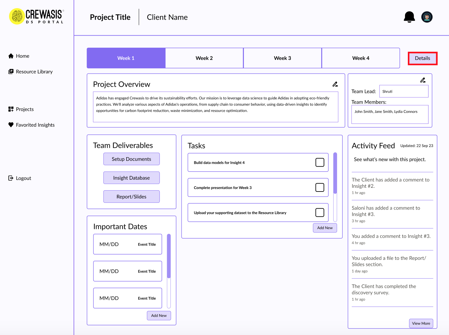
Users stated that “Details” was not clear enough language, and did not successfully indicate to them the presence of a progress tracker.
Reiterating
Reiterating
Our home screen needed to be simplified, our copy clarified, and the most essential features needed to be better highlighted.
After completing our usability tests, our design team consulted with CREWASIS in order to discuss developing the high-fidelity prototype.
Based on feedback from our testing, and a consensus among the stakeholders, we agreed that the dashboard/homepage of the portal was too busy, and included a couple features that data scientists would not use regularly.

CREWASIS stakeholders clarified that data scientists would not need access to a list of client profiles. Therefore this was something that could be eliminated from our MVP.
While users wanted to have access to past projects, suggested removing them from the homepage so as to clear up more real estate for more essential features— such as current projects.
(Re)Design
(Re)Design
Within the high-fidelity prototype, we simplified the homepage by utilizing more space within the side navigation bar. Moving access to favorited insights to the side navigation bar ensures that users will not feel overwhelmed by the amount of information presented to them upon logging in.
On the project page, we prioritized client feedback and placed the Insights CTA in a more obvious location.
We also clarified the copy of the progress bar CTA so users would better understand how to access project progress.
Data Scientist Profile Page
CREWASIS stakeholders also suggested that we develop a Data Science Profile feature. As the CREWASIS team works remotely across the country, this feature would humanize the person behind the portal, and make it easier for the various team members to access information about one another such as time zone, email address, etc.
Implementation
Implementation
The Final MVP
In response to the identified need for a unified platform that fosters improved collaboration, communication, and feedback among data scientists to enhance weekly deliverables, we have successfully designed and developed a comprehensive back-end portal for Parva. This portal serves as a robust solution to empower data scientists, providing them with the tools and resources needed to thrive in a collaborative environment.
Next Steps
Next Steps
Usability Testing on Developed Portal Iterations
Upon handoff, we encouraged CREWASIS to conduct another round of usability testing on the high-fidelity prototype before development so as to ensure peak usability for their users, and to ensure the changes we made we effective.
Onboarding
While we did not have sufficient time to develop an onboarding feature for this portal, we encouraged CREWASIS to consider implementing onboarding in order to better orient users with the platform.