Capturing More than Just Noses
A User Experience Analysis of Fragrantica
What follows is conceptual UX research project that explores the way users experience Fragrantica (a website devoted to the world of fragrance and utilized by fragrance collectors and content creators). Furthermore, this study ideates potential solutions for how Fragrantica be improved in order to optimize user satisfaction.
Research Goals
Research Goals
Do most users enjoy their experience with using Fragrantica?
Determine overall usability of Fragrantica (especially as it applies to fragrance content creators)
Identify user pain points
Develop ideas for how to make Fragrantica more user friendly based on evidence obtained via user feedback
Define
Define
Fragrantica is a database, forum, and publication for lovers of perfume.
The website Fragrantica self describes as “a comprehensive online resource, magazine, and community dedicated to fragrance enthusiasts.” It acts as a database of designer and niche fragrances, and serves as a resource for those interested in learning more about specific perfumes, the noses behind them, and the houses that create them. Users can also add and read reviews of specific fragrances, track the they’ve fragrances tested, worn, and purchased.
As a Fragrantica user, I saw the site’s complications as an opportunity to explore.
As a fragrance lover and collector, I utilize Fragrantica frequently to learn more about new or unfamiliar perfumes. But, I’m not always satisfied with my experience. The site often struggles to load or reload, and though it offers an array of features, how to use and navigate those features is not always clear.
I decided to use the fragrance enthusiast community I’ve discovered on Tiktok to find other users and identify problems they’ve experienced using the site. I know how and why I use Fragrantica, but I wanted to learn how and why the site is utilized by fellow users and content creators, and what they feel are its strengths and weaknesses.
Research Methods
Research Methods
For the purposes of this conceptual project, I employed the following research methods:
A Competitive & Comparative Feature Analysis in order to investigate how Fragrantica aligns and misaligns with its competitors.
A Heuristic Evaluation to assess the site’s usability.
User Surveys to get a sense of other users’ experiences.
User Interviews to investigate the experiences of other users in more detail and form a basis for potential solutions.
Feature Analysis
Feature Analysis
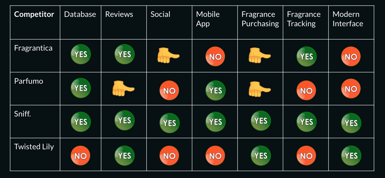
While Fragrantica’s competitors offer fewer features, some have updated interfaces more appealing to contemporary users.
The graph above visualizes my survey of how Fragrantica’s feature offerings compare to features offered by competitors. My determination is that Sniff., an application recently developed by a popular fragrance influencer, is Fragrantica’s biggest competitor. Not only does Sniff. offer a number of the same features as Fragrantica, but it also possesses a more contemporary application interface, something Fragrantica lacks. At the moment, Fragrantica has the advantages of being more well known and appearing on Google searches, but unless they take action they risk being surpassed by the tool better catered to user needs.
Heuristic Evaluation
Heuristic Evaluation
Fragrantica relies on recall rather than recognition.
This violates the “Recognition Rather than Recall” component on my Heuristic Evaluation. Fragrantica users, especially those new to the site, would likely be overwhelmed by the amount of material immediately presented, and would struggle to navigate the site overall. It is not immediately clear how the “Search” feature differs from their “Search by Notes” feature, for example. New users would likely find it difficult to identify the purposes of various drop down and menu options.
Fragrantica does not employ a minimalist design.
Users are confronted with a large amount of information on every page of the site. The photo above demonstrates both the lack of clarity in how the features are labeled in the “perfume” dropdown on the homepage, as well as the amount of information displayed on the homepage itself.
The screenshot above depicts the amount of information listed on every fragrance profile. The screen is often interrupted by ads, and there seems to be little rhyme or reason to the visual hierarchy of the information presented. It is not clear how to find specific pieces of information (such as the fragrance notes), and the side bar of recently reviewed fragrances is ever present and cannot be hidden from view.
Users have little opportunity to customize their preferences, and it’s not always clear how to exit unwanted situations on the Fragrantica website.
I determined that Fragrantica also contains notable heuristic violations in the category of “User Control and Freedom,” because the site offers very few options for customizations. It does not offer clear ways for users to return to a previous page, or indicate to them how they reached the page. This area in particular requires a significant changes in order to be deemed as an enjoyable experience, or even fully usable.
User Surveys
User Surveys
Even daily users find Fragrantica difficult to navigate.
I recruited survey participants from my platform on Fragrance Tiktok. I know from my time spent watching Tiktok videos that many creators use Fragrantica as a reference point when discussing a particular fragrance within their content, often displaying screenshots from Fragrantica in order to show their followers details about a particular fragrance.
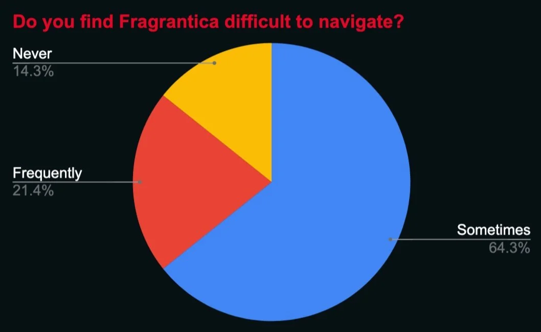
Many of the Fragrantica users and content creators agreed to complete a survey on their experience with using Fragrantica. Of the ~30 users surveyed, 50% of them answered that they use Fragrantica on a daily basis, and 43% stated that they use Fragrantica at least three times a week.
The pie chart above reflects the answers of the same surveyed users. Most of these users (93%) attested to using Fragrantica multiple times a week, and yet 64.3% of those users find Fragrantica is at least sometimes difficult to navigate, while a little over 20% find it frequently difficult to navigate. If these answers reflect the experience of dedicated Fragrantica visitors, it is easy to imagine that new visitors to the site would find it less than easy to navigate.
User Interviews
User Interviews
“Fragrantica seems stuck in 2004, everything needs revamping.”
I went on to conduct User Interviews with a sampling of the users surveyed. During these interviews, the users addressed the following questions:
What pain points do you often encounter while using Fragrantica?
What changes would you make to Fragrantica?
What features need improvements?
Overall, a consensus amongst the Fragrantica users within both surveys and interviews was that the Fragrantica site is in need of updates.
In the interviews that I conducted with frequent or daily Fragrantica users, I found that while users value being able to view the notes of their fragrances, they struggled to use the search bar and with the fact that there are multiple search bars. Users also seemed to find the interface to be in need of updates overall, both visually and in terms of how ads are presented.
“Because I don’t find [Fragrantica] easy to navigate, I’ve never use any of the features other than searching scents.”
User interviews revealed that users miss out on features because the site isn’t easy to navigate.
While a huge draw of the site is the searchable database, Fragrantica also boasts a number of other attractive features intended to be useful to fragrance collectors and lovers — such as: user reviews of fragrances, a feature that allows users to search for fragrances based on fragrances they know they like, a feature that allows users to search based on the fragrance notes, a daily wear tracking feature, the ability to create shelves, and more. While these features should be a draw for users, the lack of navigability on the site causes users to lose out on features from which they otherwise might have benefited. These are issues that could potentially be addressed with the implication of onboarding, or even a new system of navigation that takes user feedback into account.
“There’s too much scrolling for information.”
Many of the site’s pages require that users scroll past adds and information that is often placed in a seemingly random way. Users drew attention to the amount of scrolling necessary to view all of the information on a fragrance page. There’s an overall lack of shortcuts, and users would especially like to see a shortcut that gives quicker access to the reviews of a fragrance.
Persona
Persona
Sadie is a 27 year old fragrance collector and part time content creator. She uses fragrantica to keep up with industry news, read fragrance reviews, and to explore and learn about new fragrances.
I crafted user persona, Sadie, who represents the interests of the interviewed users. Sadie has many the same behaviors and suffers from the same pain points as many of the users with whom I spoke.
Sadie…
Sadie often finds herself cutting her sessions on Fragrantica short because she’s frustrated by the ads on each page, and she doesn’t like that if she wants to search by a fragrance note, she has to use a different search bar. Sadie offers Fragrantica UX designers an opportunity to design with demonstrated users in mind.
Research Conclusion
Research Conclusion
Foremost issues:
Search Bar Functionality
Appearance of Interface
Display of Ads
Lack of Onboarding
My research suggests a number of key areas upon which Fragrantica might focus development in order to improve usability and user satisfaction.
User feedback within both surveys and interviews echoed conclusions I drew from the Heuristic Evaluation I conducted. Fragrantica should seek feedback from users like Sadie while developing and implementing updates, in order to ensure that any changes align with user goals without intensifying any existing pain points.
Fragrantica is an informative and useful tool, but needs to better align with users.
Fragrantica sets out to be so many things: a database, a publication, a community, a method of fragrance tracking, a method of fragrance discovery, and more. But because it fails to connect with users through user testing, user interviews, etc. it falls short of what it could be. While the world of scent, fragrance, and fragrance content continues to evolve and adapt, Fragrantica’s interface remains stagnant. In order to keep up with newly developed competitors such as Sniff. (which has a modern app interface that caters to the needs of fragrance collectors), Fragrantica must get in touch with users in order to stay in touch with the times.


